Finding the right product (fast) — part 2
As I described in the first part of my series, reducing friction for product-focused shoppers is key to helping them reach their goal. In my first case study I focused on categories and search as a crucial part of that experience. The journey doesn't stop there however. When people successfully find a correct category or search for a specific item, they will encounter one of the most complex page types to design: a (product) list.
As lead app designer for s.Oliver I redesigned their product list, improving comparability, product relevance and overall usability.
- Position
- Lead App Designer
- Client
- s.Oliver
- Plattforms
- iOS & Android
- Responsibilities
- Stakeholder management, user research, wireflows, visual design, QA
- Credits
- Maximilian Mügge, Deepblue Networks, Hanseatics
A sneak peak of the end result

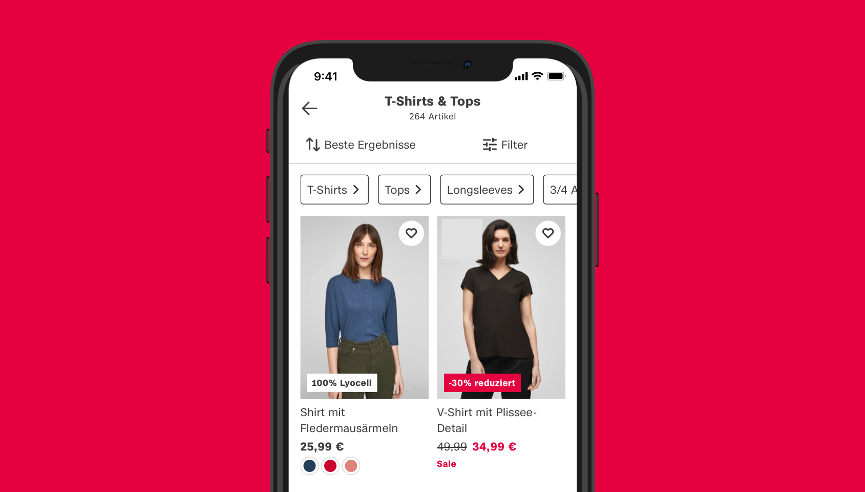
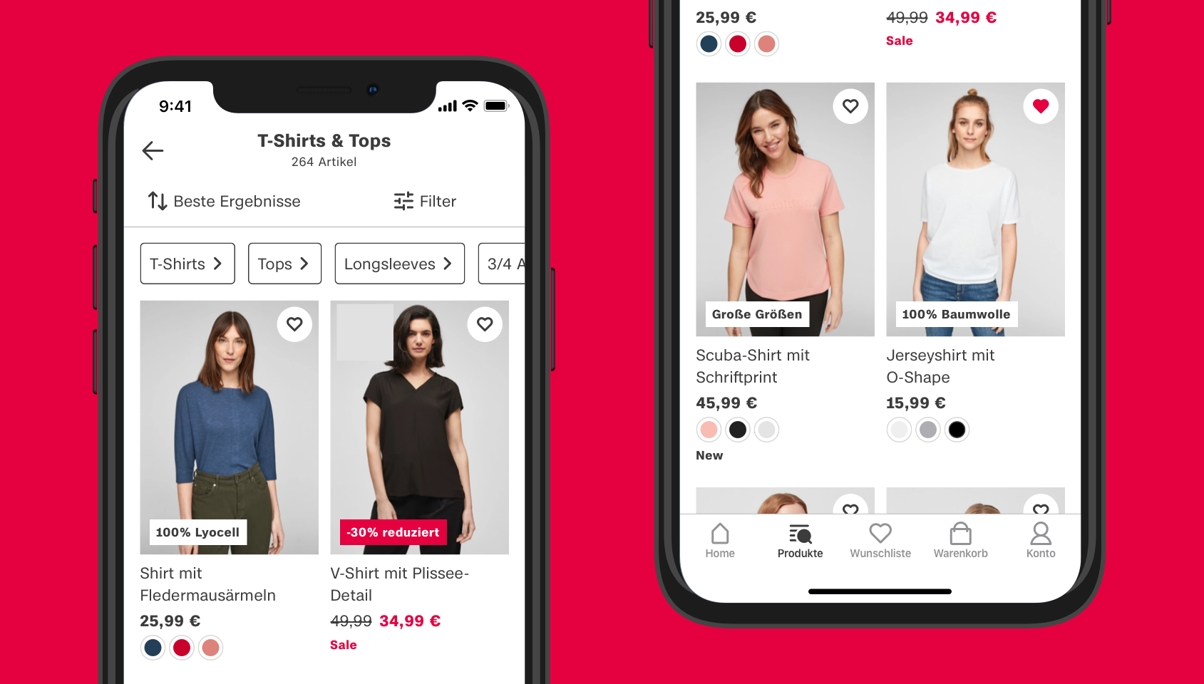
On the new product list you can see the most important information at a glance: basic info such as image, title, price and colors, but also key product characteristics, like material. Quickfilters and clear access to sorting and filters help with narrowing down the list.
So what's the deal with lists?
All lists share some basic common characteristics:
- They present a specific amount of items to the user
- Each item is accompanied by information to help identify the correct one (those currently searched by the user)
- Each item will often lead to a detail page, showing more specific information about it
- Based on the characteristics of each item, there will probably be at least some basic functionality to narrow down or sort the list
Designing those lists is one of the most complex parts of any project. List visitors have to decide which item they should give their attention to and which items to ignore. It's all about the right balance: Give people too little or the wrong information and they have to navigate back and forth between list and various detail pages to determine the correct item, thus increasing interaction cost. Give them too much information and they will be overwhelmed by a cluttered screen and will have difficulty reviewing each item, being hindered by a high cognitive load.
In e-commerce, when scanning a product list, shoppers will quickly check out the first products and decide if what they see is relevant to them. If it is not, they will see what configuration options they might have to narrow down the list. Patience is low, especially in mobile apps, since the screen size is small and not a lot of products are visible at the same time. It's neither possible to open multiple tabs like in a browser, so the ability to compare multiple products is limited.
The old product list

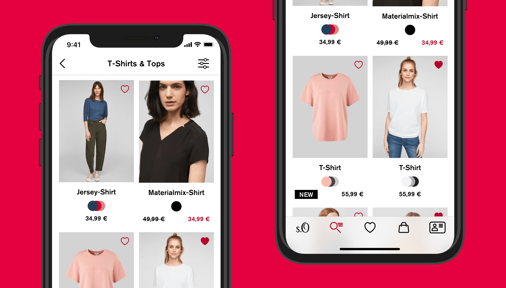
The previous product list was okay. It had the most important elements:
- Images
- A title
- The total price
- Sale prices
- Available colors
- A wishlist button
It was also very clean, so users would not get overwhelmed by too much information. Still, there are a lot of problems that needed solving:
- Images show models in an inconsistent way, which made comparability and sometimes even recognizing the product hard
- Product titles were very short and did not contain helpful information
- The wishlist icon was just an outline on the product image. On some images it was hardly recognizable, due to it overlapping with the product
- Colors were overlapping, so it was hard to recognize what colors were available
- The amount of products in a list was not displayed, so people had no quantitative indication if it would make sense to filter the list
- The filter was displayed as an icon only. While the icon complied with conventions, adding a text label would improve understandability
- There was no indication on how the list was sorted. Sorting was hidden in filters, even though it is actually a different kind of configuration (changing order as opposed to reducing quantity)
The unknowns
Improving all problems mentioned above would be a good step in the right direction. But when working on this project, we realized that we had to answer another key question:
Is there enough information to help customers with deciding which product to look at?
We found out that s.Oliver had a lot of additional product information. This information was already being used on product detail pages. But before deciding on what information to display, we had to figure out what was actually important to our customers.
Our goals
These were our main goals for this project:
- Provide clearer options to configure the product list, so people can find relevant products faster
- Reduce the interaction cost of finding a desired product, by displaying the most relevant information on the product list
- Improve accessibility and overall usability
Our solution
Product list configuration

- Directly under the title the amount of products in the list is now being displayed. This will help people with deciding whether they want to filter the list or keep scrolling
- We separated filters from sorting, to make a clear distinction between those two configurations. They now have their own icons and a text label which improves understandability
- Filters and sorting are now placed in a sticky bar that will hide when scrolling down and come out again when scrolling up. This way the bar can be accessed more easily than the old filter icon, while still reserving enough space to focus on the products, when scrolling down.
- Under filters we display additional product subcategories which help people with quickly narrowing down the list, if they look for a more specific type of clothing
The products
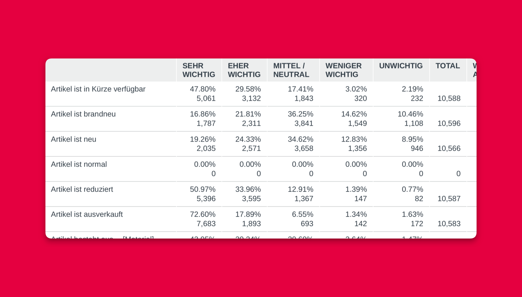
Before we started working on the product tiles, we had to decide on the importance of various types of information. We did this by conducting an e-mail survey using the s.Oliver newsletter. Since there was no user research done at s.Oliver before that, this was the perfect option to kickstart this. It was also a good method to reach our target audience while keeping it low-budget and uncomplicated. And it worked! With over 10.000 participants the result was more than satisfying. 🙂

Here are our top 3 candidates:
- Price reductions
- Additional promotions
- Material / Sustainability
We had a lot of additional product characteristics, but they were all regarded as unimportant by our customers. We could pretty much use all the insights from our survey to prioritize information on the product tiles. We just made one important exception:
In our survey customers regarded additional size options as unimportant. Nevertheless we decided to display them with a higher priority than material. Why is that? Well, if you shop at s.Oliver and need those sizes, the product list would be useless for you without that information. Even though this might not be important to everyone, we decided that it would have too high a negative impact on those people. So our final top priorities were:
- Price reductions
- Additional promotions
- Additional sizes
- Material / Sustainability
The end result

- We changed the images guidelines, so the products are now being displayed more consistently
- Product titles are now longer and more descriptive
- Colors don't overlap anymore. You can now also see more than 3 colors
- Information about the product state (new, regular, sale) is now displayed in a lower priority
- The wishlist icon now has a white background which makes it stand out and products won't overlap with it anymore.
- The height of the product tiles will be calculated according to the displayed content, so the perceived distance between tiles will be consistent
- As an additional information we added a badge in the lower left corner of the product image, so it will be directly related to the product. The badge contains either information about promotions, additional sizes or material. Which of those information is being displayed was defined according to our guidelines.
- As a final touch I created a nice little Lottie animation to make the interaction more delightful
Lessons learned
With the new product list, we found a way to increase usability and product relevance for our customers. It was exciting to find out about what really matters to them through our research. It not only helped with prioritizing information from the customer's perspective, but also with balancing out marketing requirements and user needs.
I learned that a product list is never finished. It needs to adapt to their user's needs and preferences, which can change with time. We managed to design a good generic list, but a lot of various topics still remained untouched. In my mind the perfect list would change, based on a specific person's situation and desires. It could show different information, based on where a person came from, what filter's they chose or what personal preferences they have.
Finding the right balance of how much and which information to display is really hard to accomplish. It's vital to continue improving a list by learning all you can about the people who use it and the situations their using it in.