Finding the right product (fast) — part 1
In e-commerce there are many different kinds of shoppers, each with their unique traits and needs. Sometimes people like to browse and get inspired, sometimes they do a lot of research and sometimes they know exactly what they want. For those product-focused shoppers, finding their desired product as fast as possible is crucial to their experience.
While there are a lot of aspects that help customers achieve this goal, two of the most important ones are an efficient search and clear product categories. Both help with different needs: search allows finding a specific item, while categories help customers narrow down all available products to a manageable list. Making both elements as simple and easy as can be is key to helping them reach their goal.
As lead app designer for s.Oliver I redesigned their product catalogue to increase overall usability, accessibility and conversion.
- Position
- Lead App Designer
- Client
- s.Oliver
- Plattforms
- iOS & Android
- Responsibilities
- Stakeholder management, workshops, wireflows, visual design, icons, QA
- Credits
- Maximilian Mügge, Deepblue Networks, Hanseatics
The result

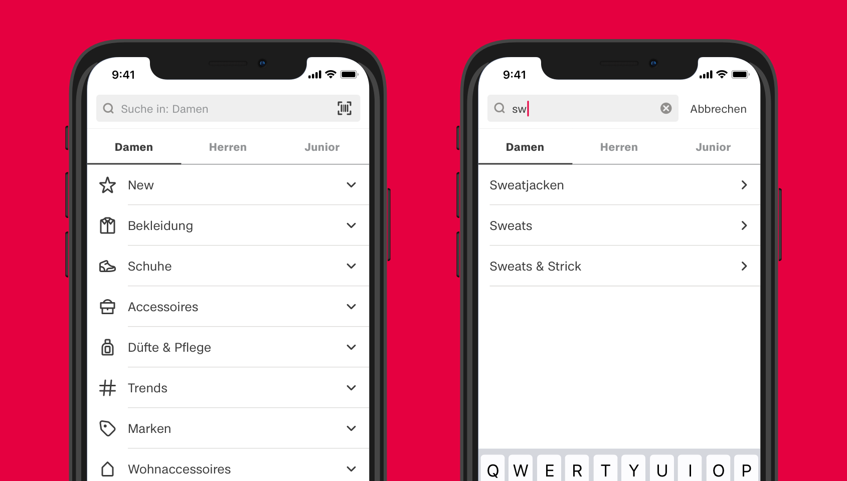
With the redesigned product catalogue you can reach a narrowed-down product list with just two clicks. Swipeable tabs and collapsible accordeons make for easy switching between categories, without leaving the screen. Icons help with quickly scanning and understanding the main categories.
The before
Problems with the previous search

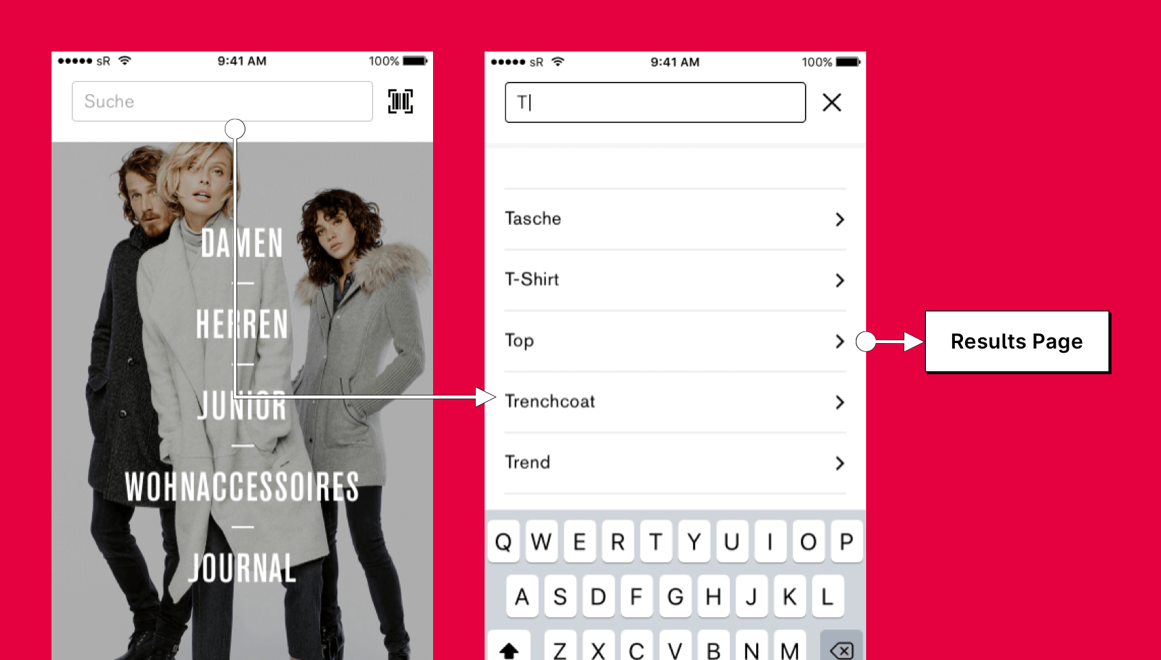
- Search results were less relevant, because they showed articles across all categories. People searching for women clothing would also find men and kids clothing
- Search suggestions showed categories, but clicking on them searched for their text value instead of opening the category. This led to less specific search results. For example searching for "trousers" and then clicking on the corresponding category would open a product list with not only trousers, but all products where trousers were mentioned in their product description.
Problems with the previous categories

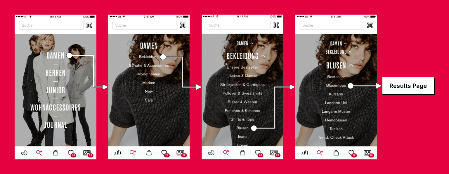
- Bad accessibility and leggibility due to small white text on a picture
- Editors had to change the background picture on a regular basis, which created unneccessary costs
- Categories were not clearly indicated as clickable elements
- Only the text was clickable, not the surrounding area. This made it hard to actually hit the touch target on the screen
- It was hard to switch between categories, because opening a top-level category, made all other categories disappear. You had to go back and forth to do this.
- There were just too many sub-categories. This led to a lot of going back and forth, which means users had a high interaction cost without actually seeing any products at all and without being able to evaluate if it was the correct category. Also a lot of sub-categories had confusing names that just weren't understandable.
- Opening those very specific categories would sometimes lead to product lists with only two or three products. This means product lists often were a dead end for customers and they had to go back again.
The after
After analysing all the problems we comitted to some main goals for the new design:
- Reduce interaction cost as much as possible for finding a desired category and switching between categories
- Enable users to encounter product lists with enough products to browse through
- Improve accessibility through better contrast, leggibility and bigger touch areas
Preselected main categories for search and categories
One of either women, men or kids is always selected. For search this means more specific results. Search history and suggestions can also be specific to those categories, improving user control over what they want to search. For categories this decreases interaction cost, because customers don't have to open and close those categories anymore. They just tap them or swipe to the right or left.
Adaptive main category order

The default order is first women, then men and at last kids. With about 75% female customers, selecting this order speeds up the process for the majority. Depending on the chosen main category of your profile the order can adapt, which means that for people choosing to buy men's clothing the order would be men, women, kids.
Categories as accordeons
Displaying categories as accordeons makes checking sub-categories really fast. We refrained from closing all other categories, when one is clicked, even though this is a typical behaviour. This comes with two benefits:
- It enables users to quickly compare different categories
- It prevents a typical problem with mobile accordeons: When opening regular accordeons, the content height could shrink a lot, because another accordeon with a lot of height would be closed simultaneously. This often results in the selected accordeon moving out of the viewport.
We also added icons to each top-level category for quick scanning and to improve language-barriers. Each sub-category will now lead to a product list, so no endless sub-categories anymore. Also the whole cell is clickable now.
The finishing touches ✨
We added two additional details to improve usability:
A second tap on "products" activates the search bar, so people don't need to reach up to the top of the screen to search something.
When opening a top-level category that sits right at the bottom of the visible area, you would hardly notice, that it actually opened. To help, we added a little automatic scrolling just for this case.
There's more...
Categories and search are important, but to be able to find products there are many other aspects we have to take into account. Want to know more? Check out my next case study: Finding the right product (fast) — part 2