Nailing the basics: mobile navigation
With increasing complexity of mobile apps, having a simple navigation has never been more important. Nevertheless looking through App and Play Store you'll find a lot of apps with overly complex navigation, hidden menus and counterintuitive architecture.
When cellular provider otelo relaunched their iOS and Android apps in 2016, one of their main promises to users was a simple navigation. "Everything you need on just two screens" was what they claimed. What may have been an award-winning navigation then, sadly is outdated today. As lead app designer I was tasked to join the otelo team to help them reach their starting goal for 2020: improving their navigation.
- Position
- Lead App Designer
- Client
- otelo
- Plattforms
- iOS & Android
- Responsibilities
- Stakeholder management, presentations, wireflows, visual design, icons, QA
- Credits
- Deepblue Networks, Hanseatics
The result

Well, it's just a standard navigation, isn't it? — Yes, it is! 🙂 Standards are what enables users to find their way with ease. Plus they enable us designers to focus on innovating in new areas. In otelo's case they also solved a lot of issues.
Let's have a look at the before

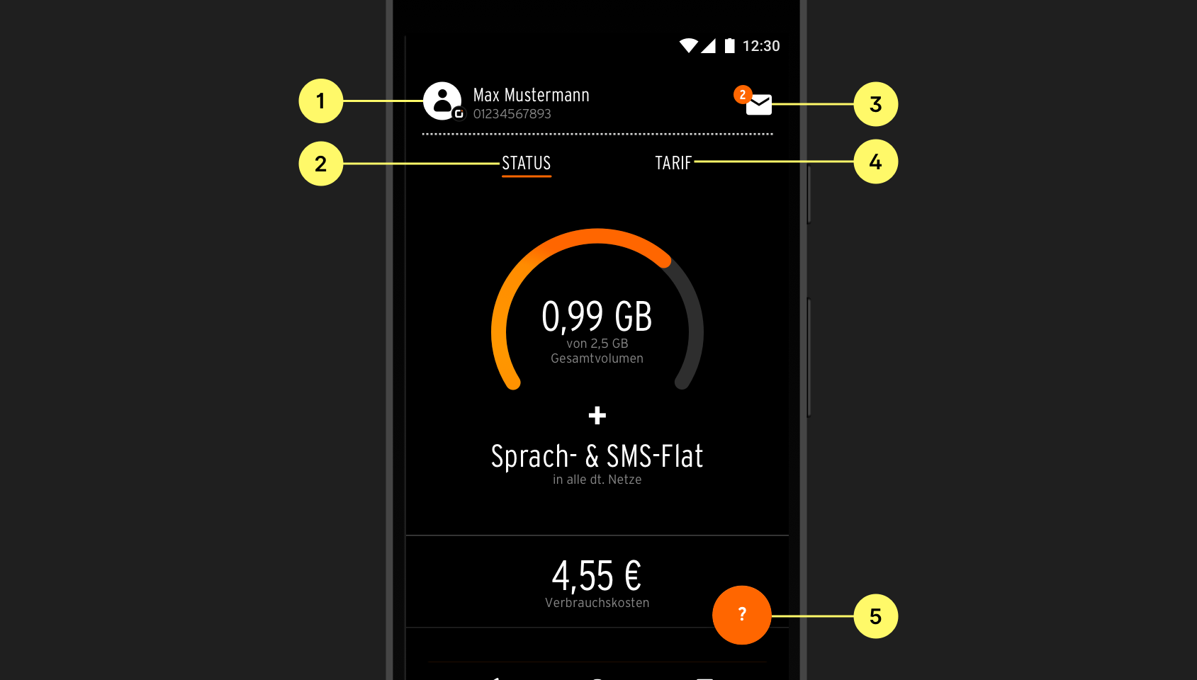
As opposed to otelos original claim –– "Everything you need on just two screens" –– there are actually five main areas of the app:
- Account details
- The tariff status
- Notifications and messages
- Tariff details with additional options
- Digital services
Each one of them was located in a different area of the screen. Additionally they were represented by different UI elements: Swipeable text tabs, an avatar picture, a mail icon and a big orange floating action button on the bottom right.
There were several problems with that:
Scattered navigation
You really have to make the effort to discover what areas there are.
Cluttered screen
There are different elements everywhere. Even though status and tariff are the most important areas, their design is very subtle. On the other hand the other three areas are very dominant. Especially the orange floating action button takes away focus and looks like the primary action of the screen, even though it's not.
Unclear interactions
Status and tariff look like they are just text elements. While subtle design is good, for inexperienced users they may not even seem clickable. Also a lot of people don't know tabs can often be navigated by swiping.
The orange button is just labeled with a question mark. It may be unclear what the button would do when tapped. Will it open tutorials or an FAQ? Maybe a contact form or chat?
Growing mobile device sizes
Four of five elements are positioned almost at the top of the screen. On big mobile devices they are really hard to reach.
No text labels for icons
Icons are awesome to have because they help to understand the UI no matter what language a person speaks. Nevertheless using icons without accompanying text, or in this case, an avatar or a question mark, is not enough to explain what lies behind those elements. Text labels are extremely helpful for understanding the meaning behind icons.
Misused modality
Account, messages and services are all opened in fullscreen modal views, which should only be used for self-contained tasks with a fixed start and end and require an explicit action to exit. Using modal views here could lead to using up a lot of device memory, because the background task is being kept active. Also it makes navigation much harder. People might mistakingly close the whole modal and return to the start screen instead of just going back one screen at a time.
Fortunately there's a simple solution

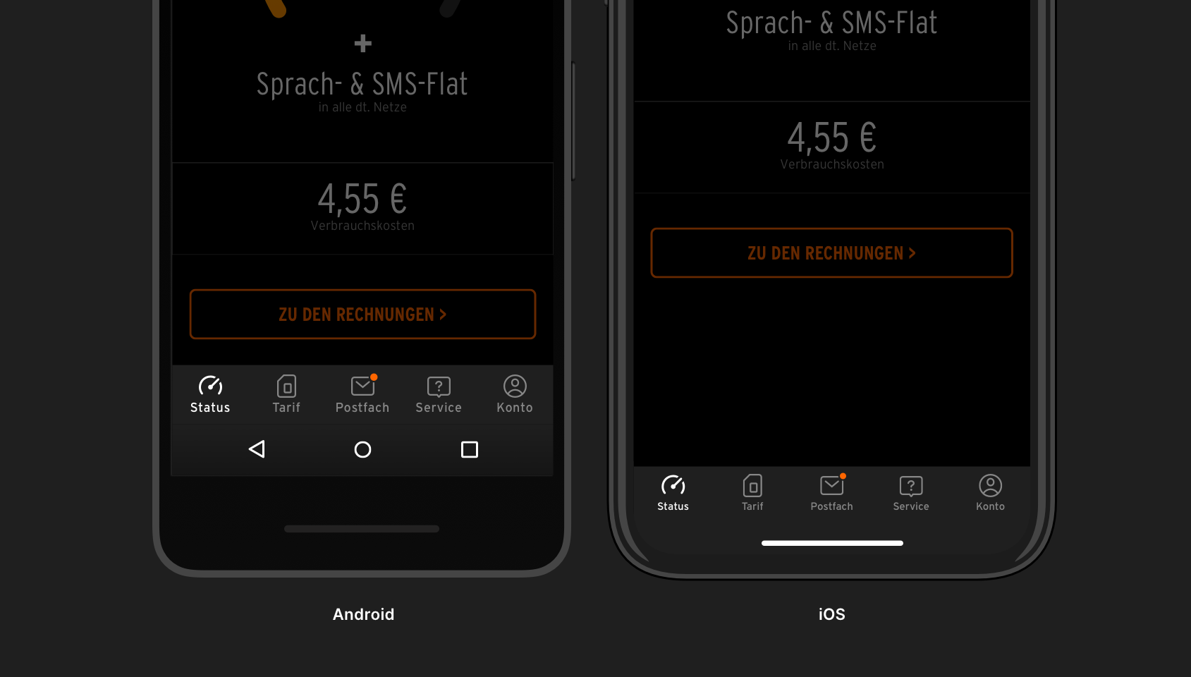
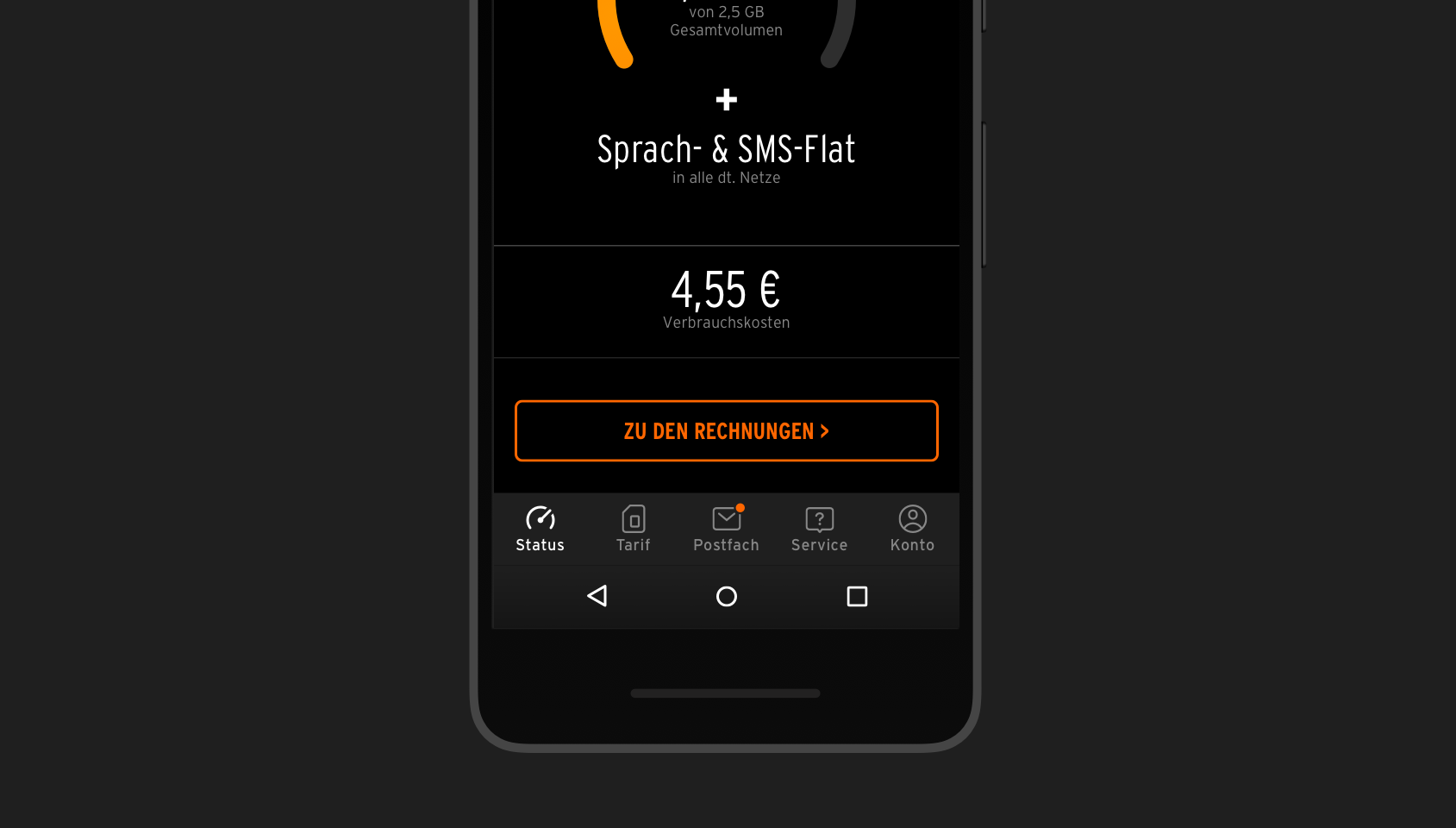
A consistent navigation at the bottom of the screen! Placing all main areas near to each other as a fixed bar at the bottom fixed all the previous issues:
- All main areas are placed according to their importance from left to right, making the hierarchy clear for users
- Every main area is represented consistently by an icon and text label, improving the discoverability of all areas and their accessibility
- Having all areas in one place cleans up the screen, making it look more polished and easy to scan
- All areas are easily reachable on every device no matter the device size or if right or left-handed
- Having a navigation at the bottom is a standard nowadays. People are used to it and will easily find their way!
- iOS and Android natively support this kind of navigation, known as a tab bar on iOS and bottom navigation on Android. This makes implementation easier and helps with backwards-compatibility
- All areas will be opened in a "normal" way (no modals any more). This makes the correct use of modals possible: All areas where data can be edited were implemented as a modal view.
Lessons learned
Nailing the basics with mobile navigation might seem like an easy task. Just put the menu at the bottom, right? Not so fast — changing the main navigation of an existing app almost always goes with changing the whole app architecture. Most likely developers will dig up some good ol' outdated code and have to clean up a lot of mess from 100 years past. When doing that, designers have to confront numerous side effects that will unerringly pop up.
Yet it was really worth it! Having improved navigation, otelo was ready to tackle their next big projects, confident that users would find everything and be able to complete all their tasks. For me personally this project taught me to appreciate the thought that went into creating these components that have earned their right to be a standard nowadays! And by using them, we can focus on innovating in new areas without any established standards.